LLOYDS BANK

Lloyds Bank has a strong presence in the UK banking sector, but its digital banking experience lacked a modern, user-friendly interface tailored to a younger demographic. With the rise of neobanks like Revolut and Monzo, traditional banking apps needed to evolve to meet user expectations for convenience, clarity, and efficiency. This redesign focused on enhancing the banking experience with a vibrant and intuitive interface, structured around a "bento box" design. The app now provides quick access to essential banking features while maintaining a sleek, modern aesthetic.
challenge
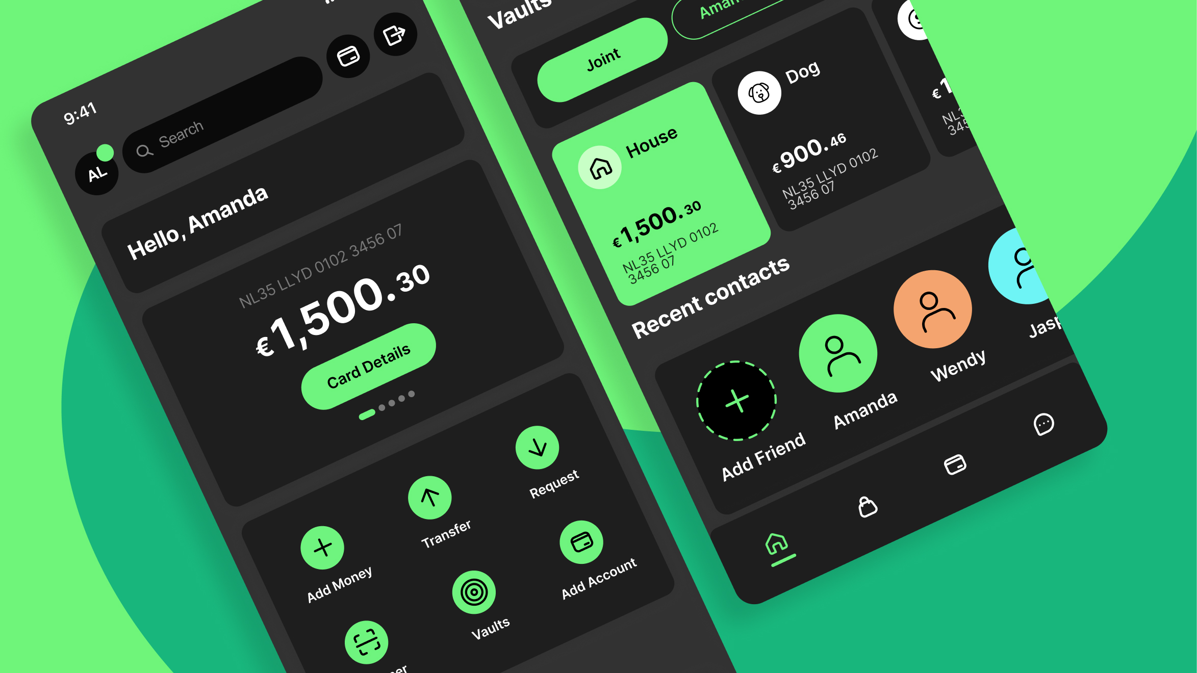
Traditional banking apps often feel outdated, cluttered, and inefficient compared to digital-first banking solutions. Users, especially younger generations, expect a seamless, easy-to-navigate experience, personalisation options such as filters for accounts and transactions, a visually appealing and well-structured interface, simplified money transfers, and light/dark modes for accessibility and preference. Lloyds Bank needed an upgrade to remain competitive while preserving its trusted legacy.
solution
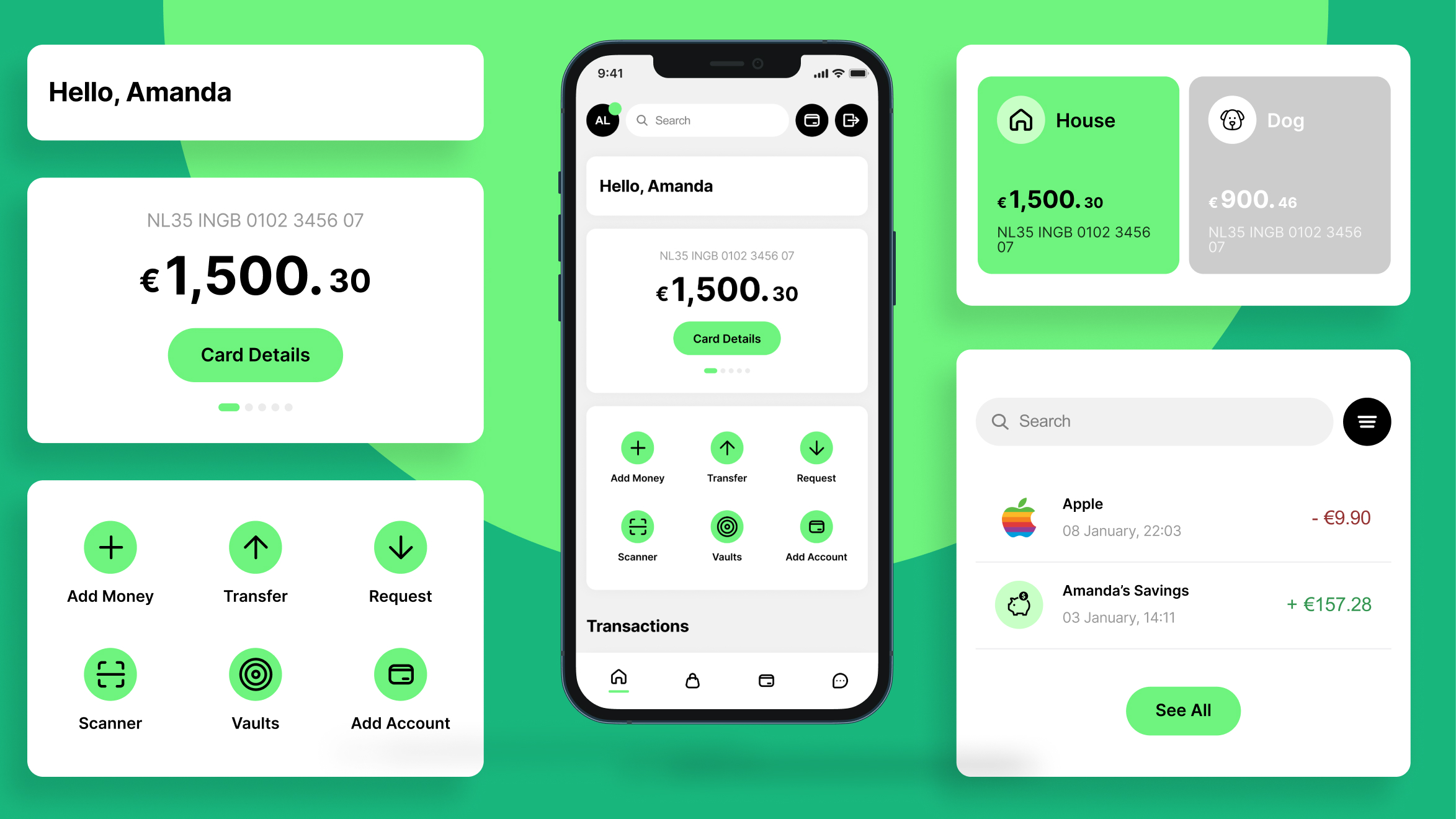
The redesigned app brings a youthful and engaging approach to mobile banking. The modern, bento-box design ensures quick navigation and clarity. The bright green and white theme, combined with a dark mode, enhances accessibility and aesthetic appeal. The financial overview has been improved to provide a clear dashboard displaying account balances, easy vault access, and a transparent transaction history. Money transfers have been simplified into a chat-like experience, inspired by Revolut, allowing users to send and request money effortlessly. Smart filtering lets users view transactions based on their account type, such as individual or joint accounts. Pots and savings management are now visually streamlined, making it easier to track financial goals. An integrated search function allows users to quickly find transactions, contacts, or settings.
how
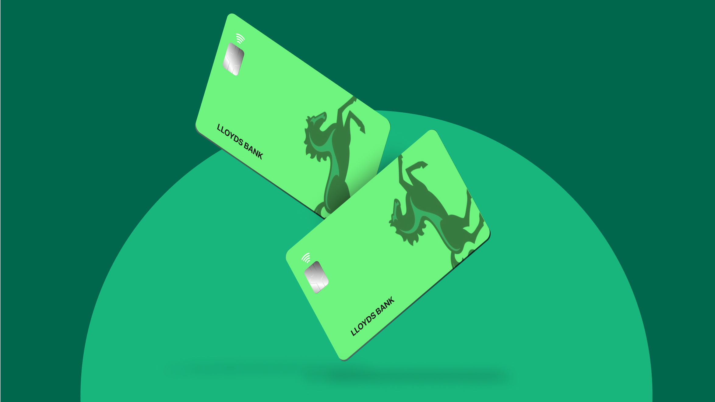
The redesign process followed a structured, user-centered approach. Extensive user research was conducted to analyse pain points and benchmark against competitive apps. Wireframing and prototyping helped create interactive mockups with intuitive navigation. The visual design was developed with a youthful, minimalist aesthetic that ensures clear contrast and easy readability. A/B user testing provided valuable feedback, refining the experience. An iterative development process was adopted, implementing continuous improvements.
result
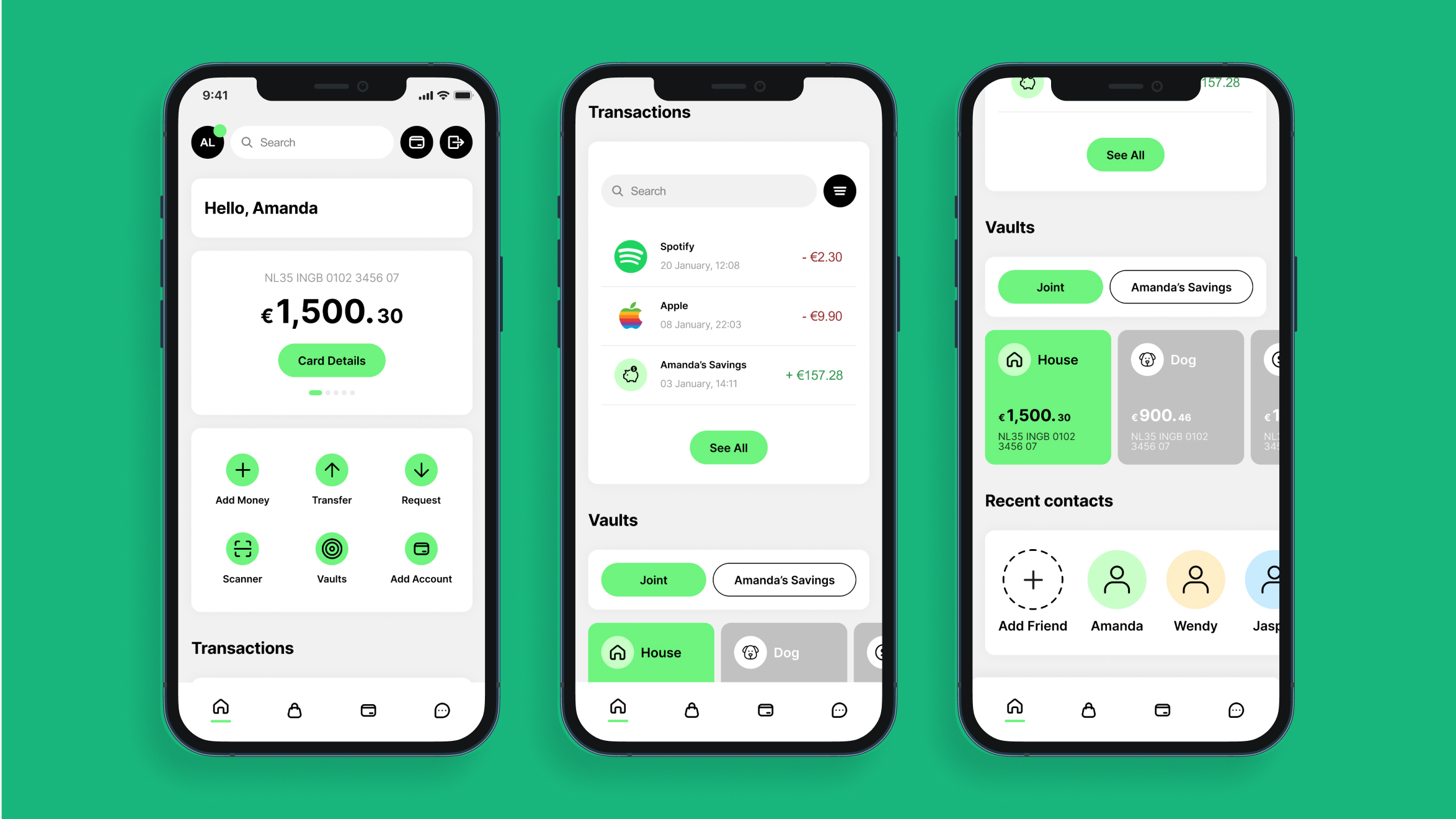
The redesigned Lloyds Bank app now delivers a modern, efficient, and engaging banking experience. User satisfaction has been significantly enhanced with a clean and dynamic UI. Transactions are faster and more intuitive through chat-inspired money transfers. Organisation has improved with filters and a clear financial overview. Accessibility has been broadened with light and dark modes, catering to different user preferences. Lloyds Bank now has a competitive edge against digital-first banking apps, ensuring its relevance in an evolving financial landscape while offering an experience tailored to the needs of today’s users.