RENRUN

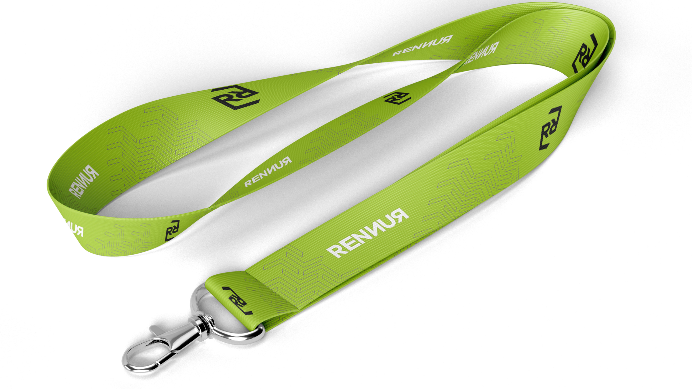
Renrun is a micro company focused on innovation, particularly in the realm of coding and technology. With an emphasis on cutting-edge solutions, the company’s branding reflects its commitment to modernity and tech-savviness, ensuring that its visual identity aligns with its innovative approach.
challenge
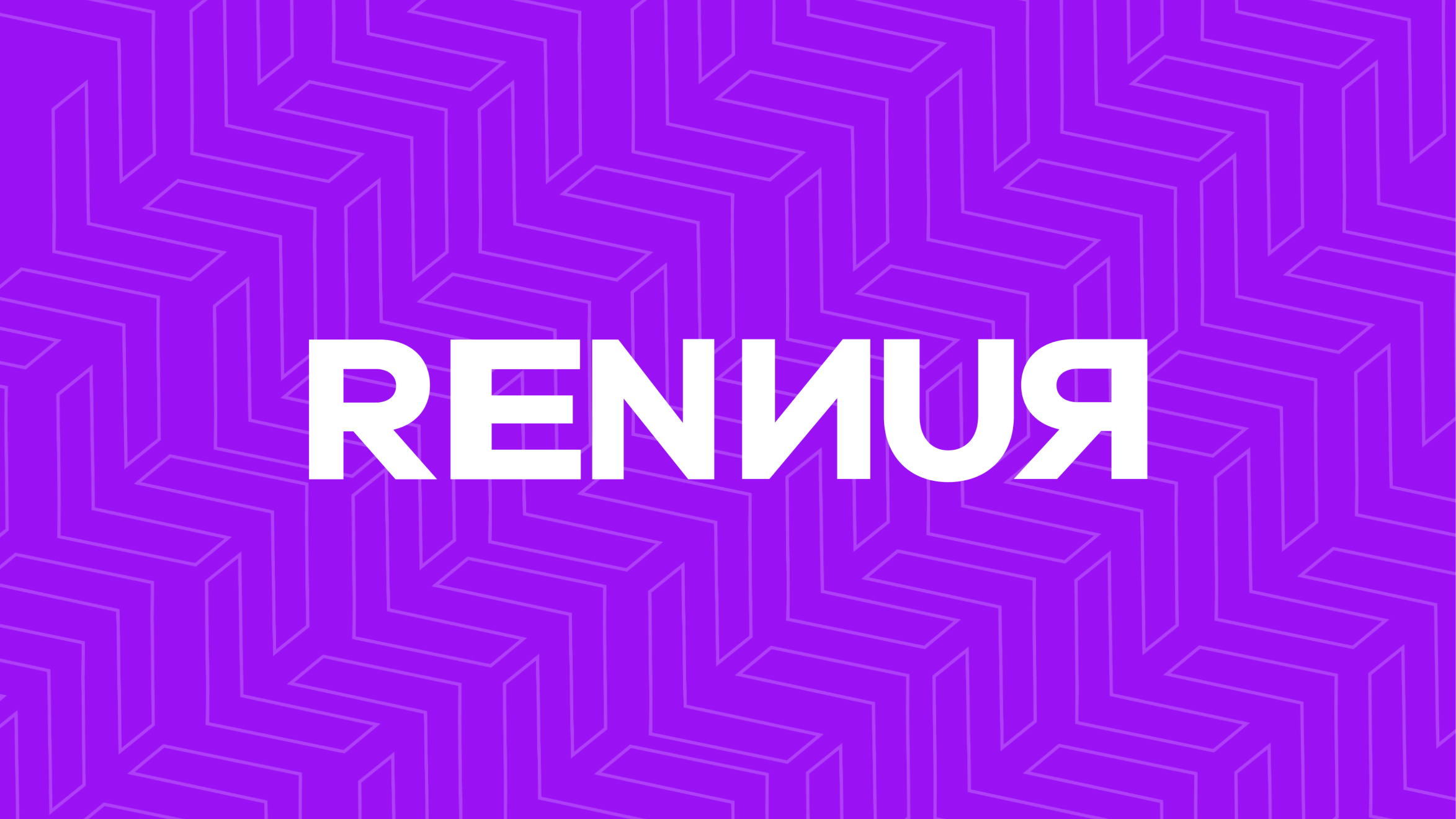
Renrun needed a branding identity that effectively communicated its focus on technology and coding, while also standing out in a competitive and dynamic industry. The challenge was to create a logo and visual elements that would reflect their expertise in a modern, youthful, and innovative manner.
solution
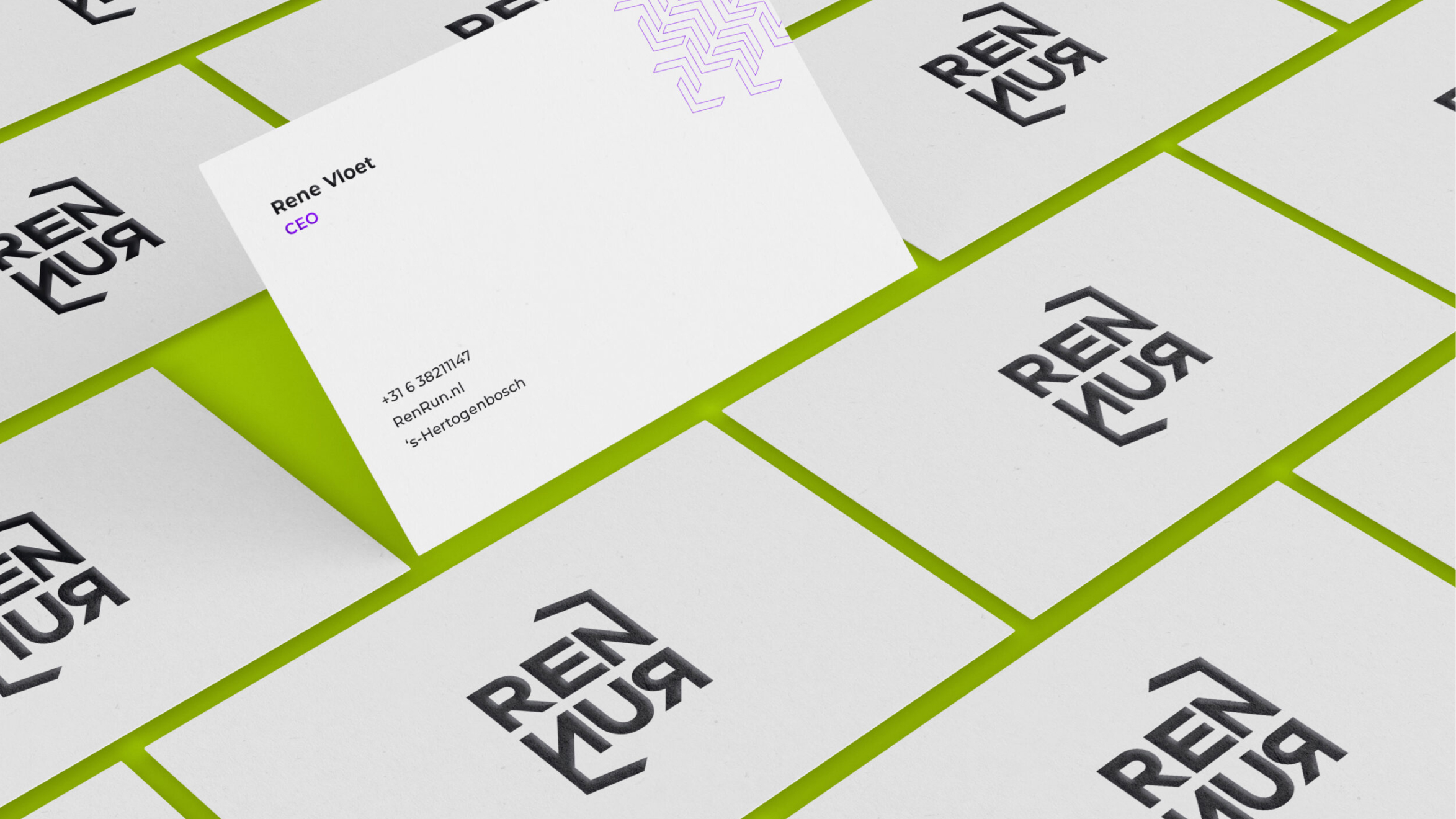
Renrun’s logo was designed with the universal coding symbols “</>” to directly represent its proficiency in coding and technology. Additionally, the brand adopted the sleek Anek Tegulo font, a modern sans-serif typeface, to convey efficiency and simplicity. The color palette was carefully chosen to include electric purple and lime green, reinforcing the company’s youthful and innovative identity.
how
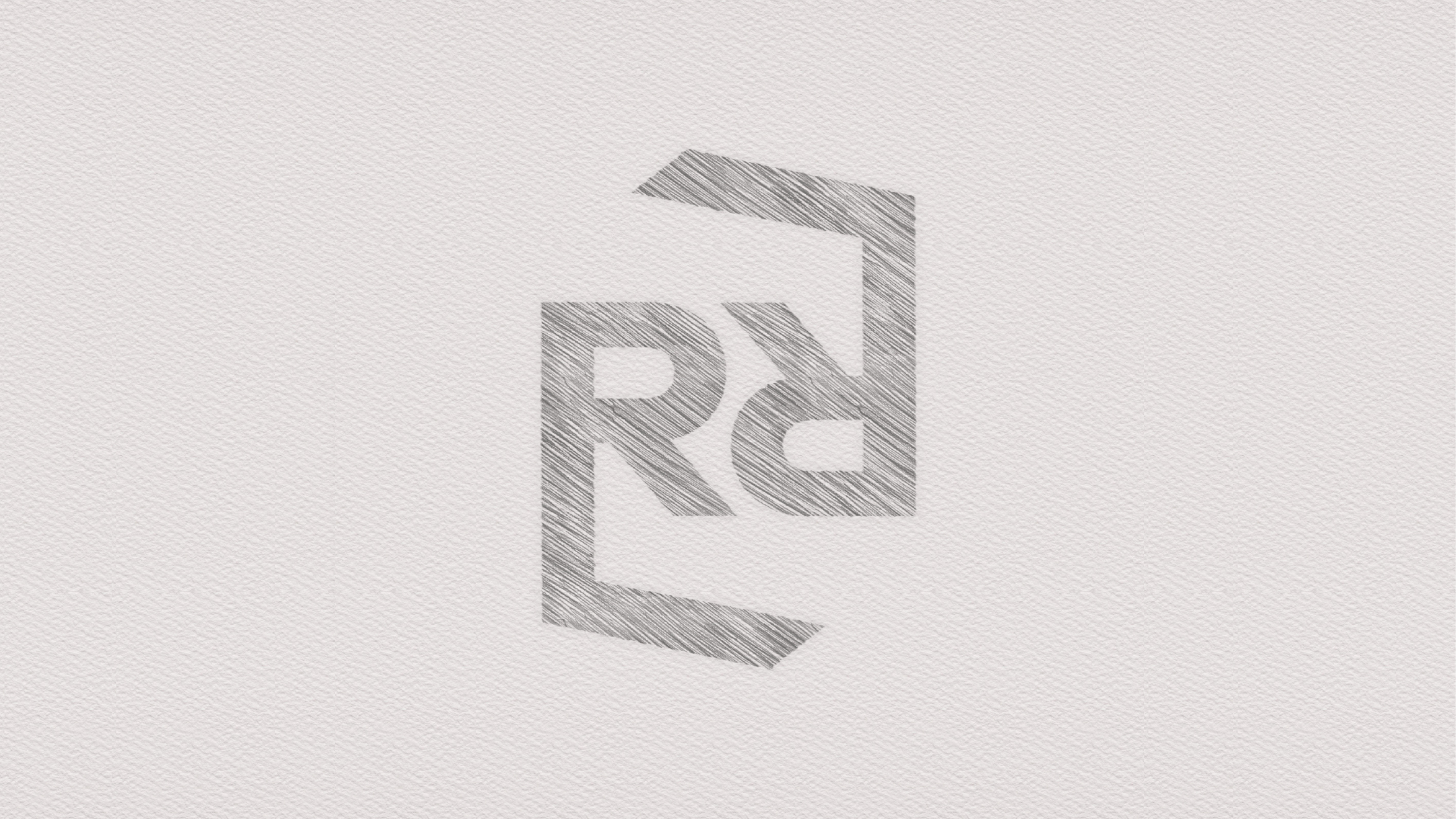
The “</>” symbols were integrated into the logo to make an immediate connection to coding, a clear visual cue for the tech-savvy audience. The Anek Tegulo typeface was selected for its clean, modern look that aligns with Renrun’s focus on simplicity and innovation. The use of electric purple and lime green provided vibrant energy, symbolizing creativity, growth, and individuality.